

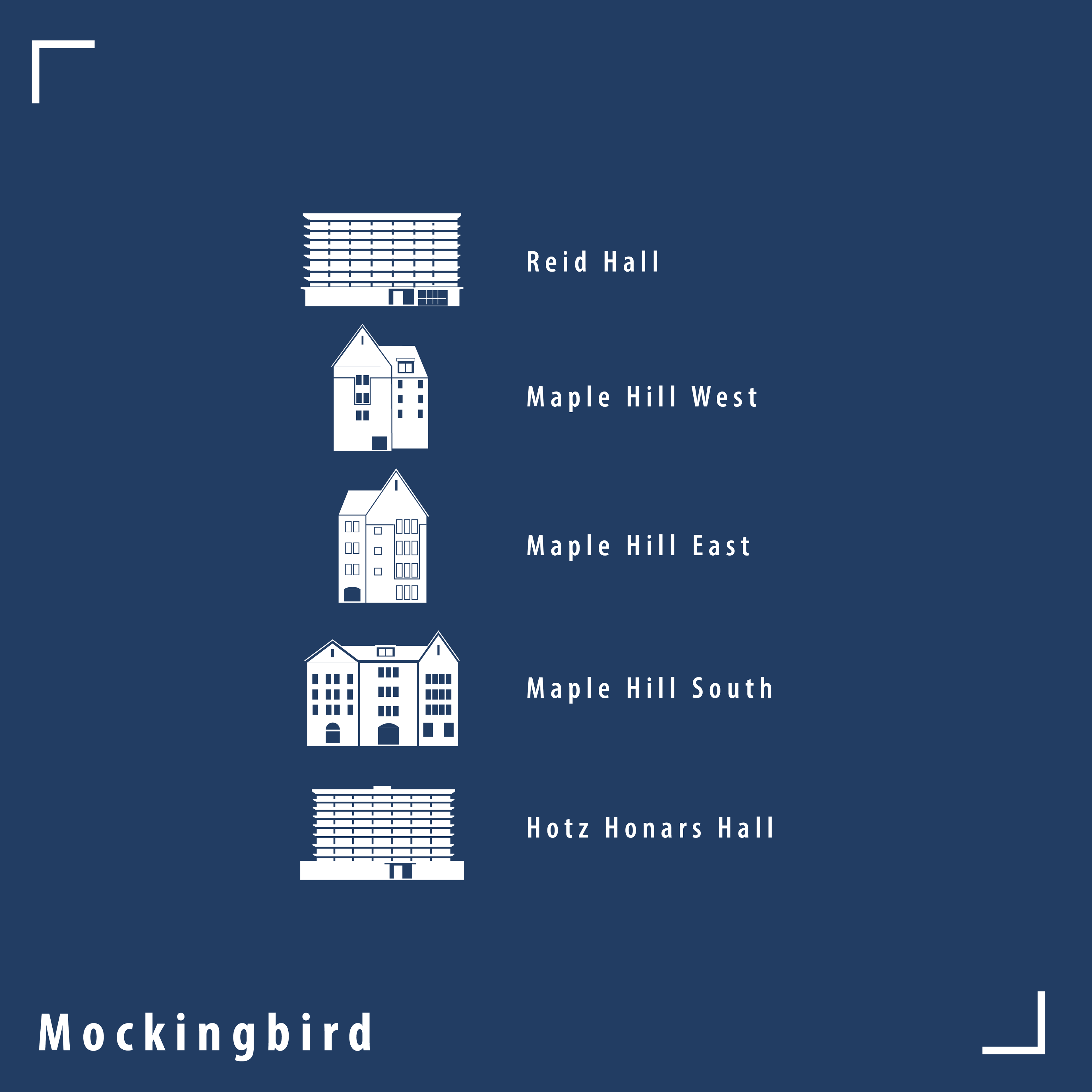
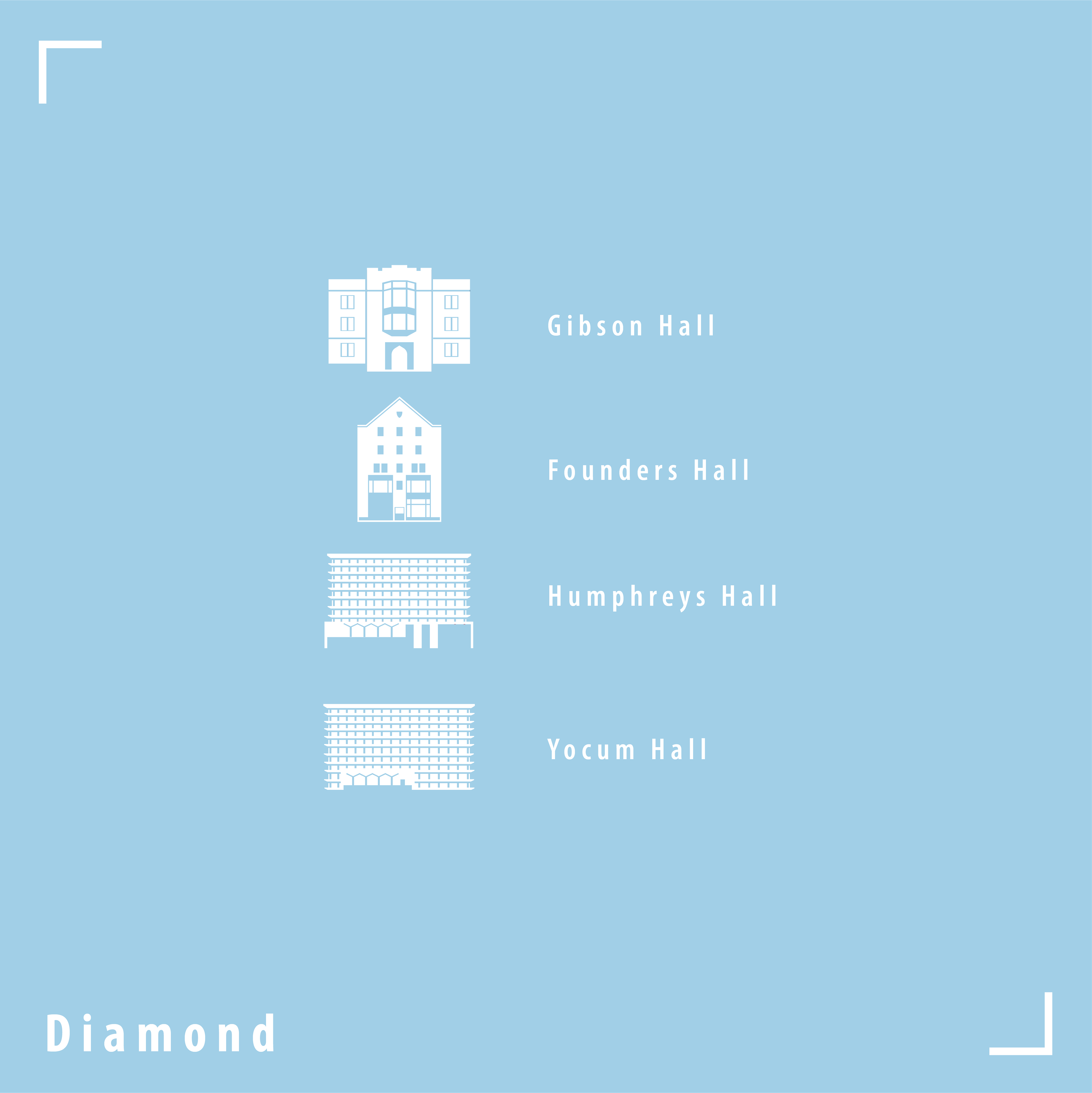
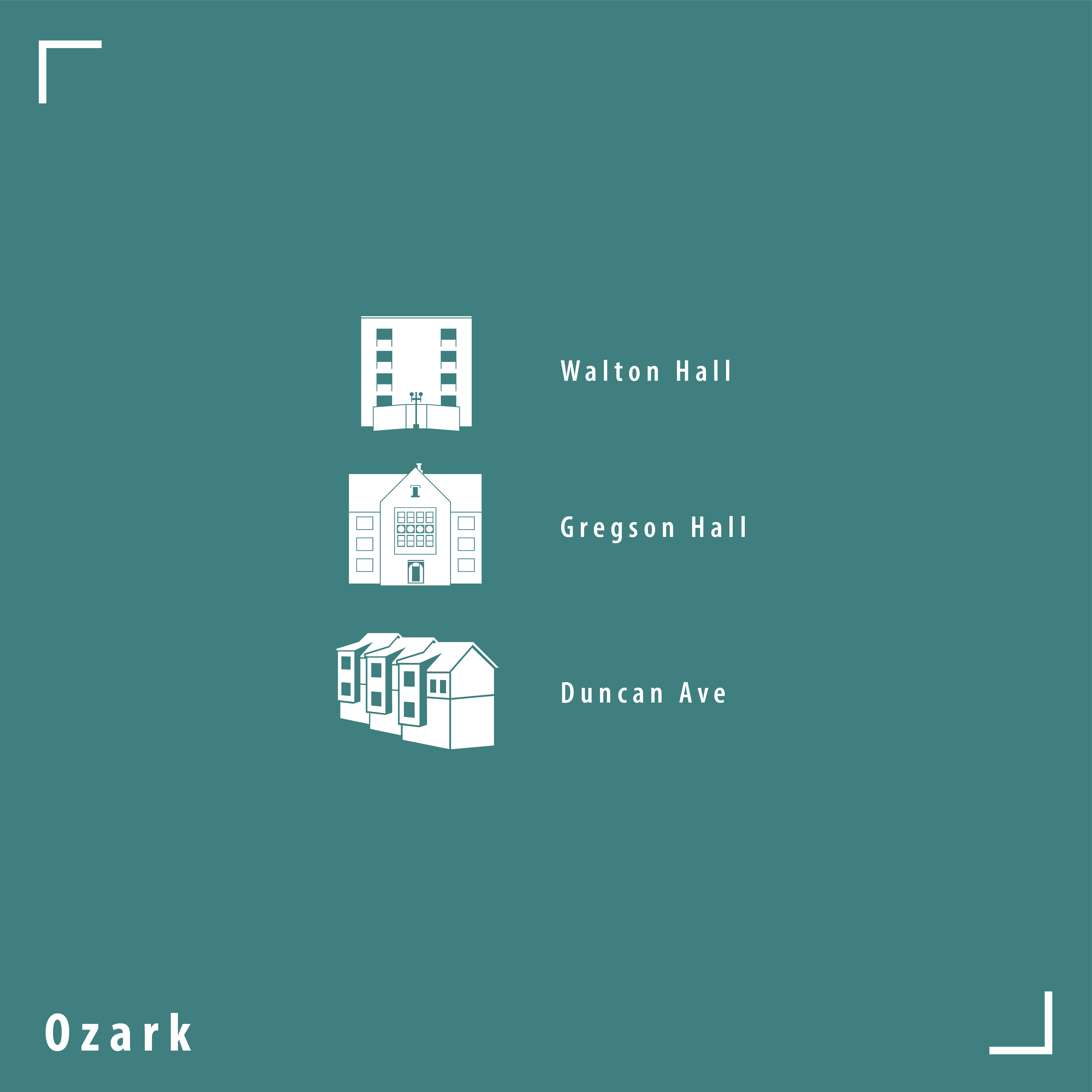
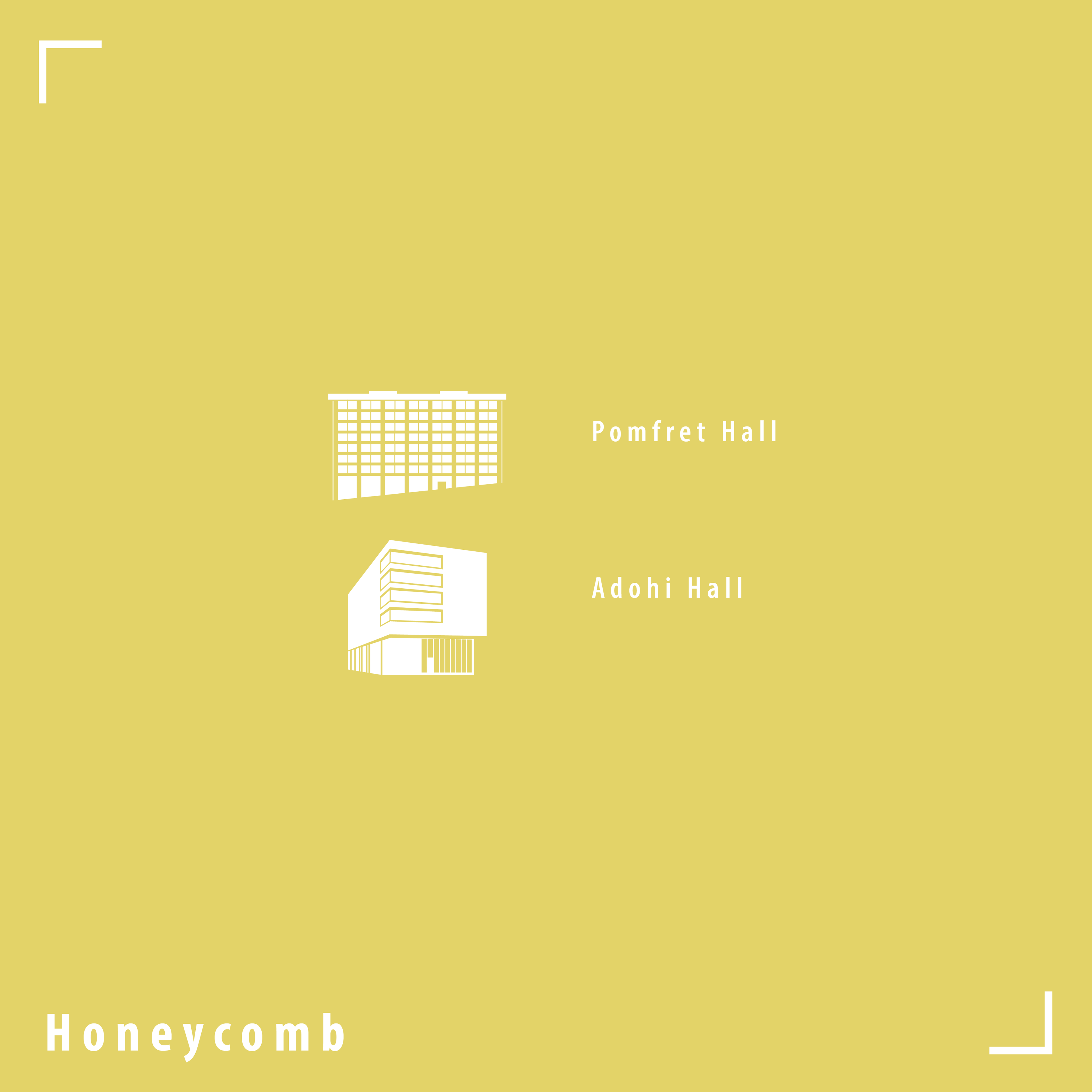
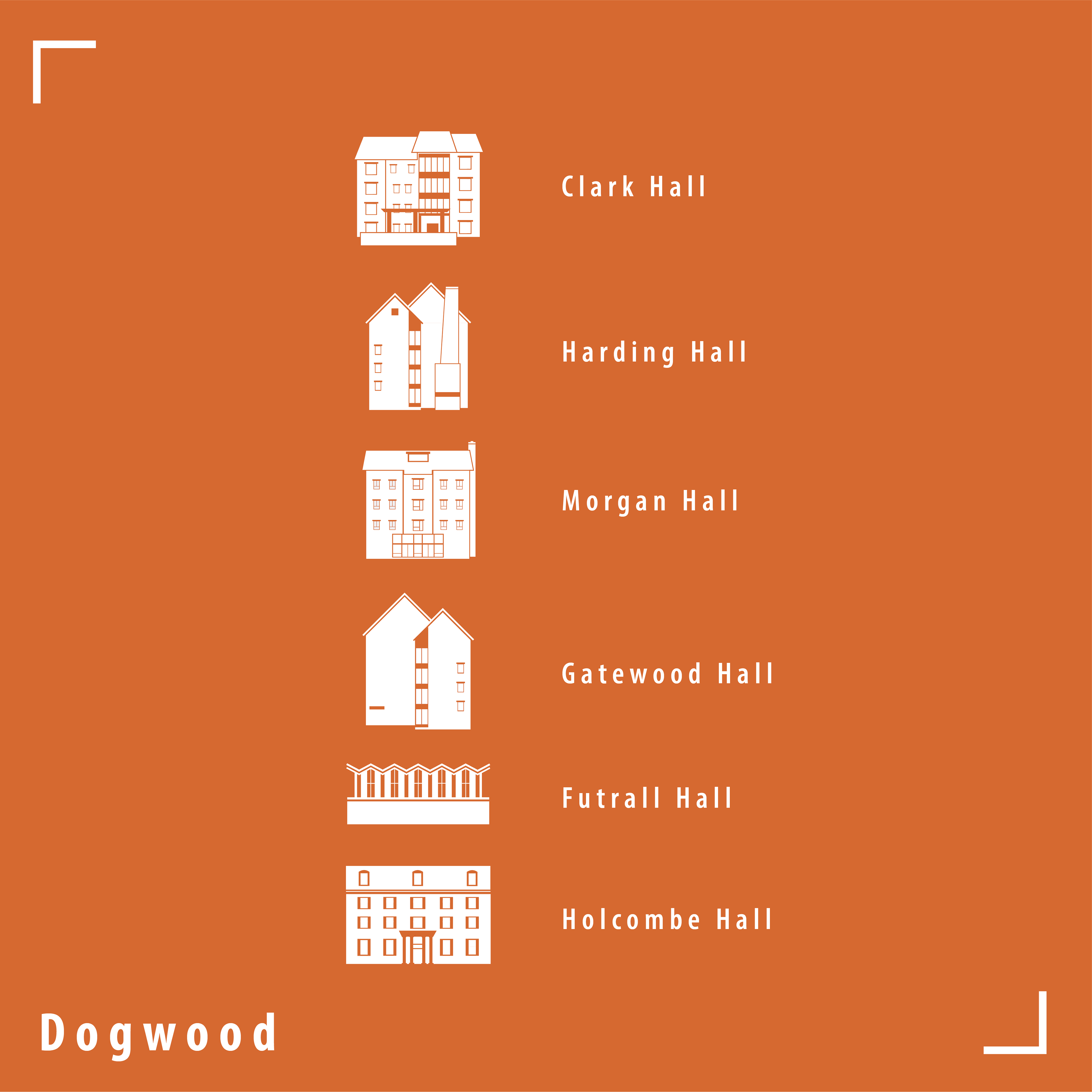
This was my largest internship project, where I developed five distinct brand identities, each including a logo, color palette, map, and informational documents. Housing restructured the twenty dorms into five neighborhoods based on location and culture. Throughout the branding development process, we held numerous meetings to discuss the significance of these neighborhoods and their impact on campus living.
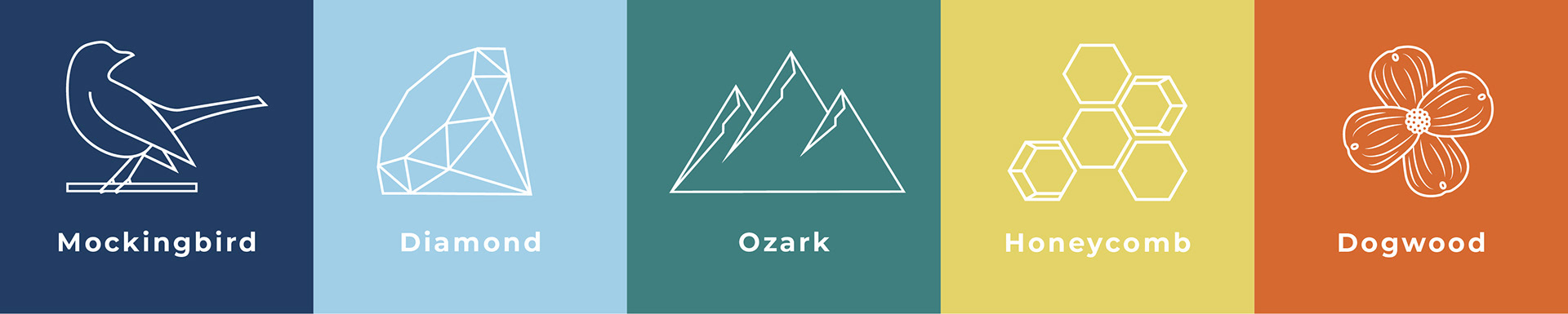
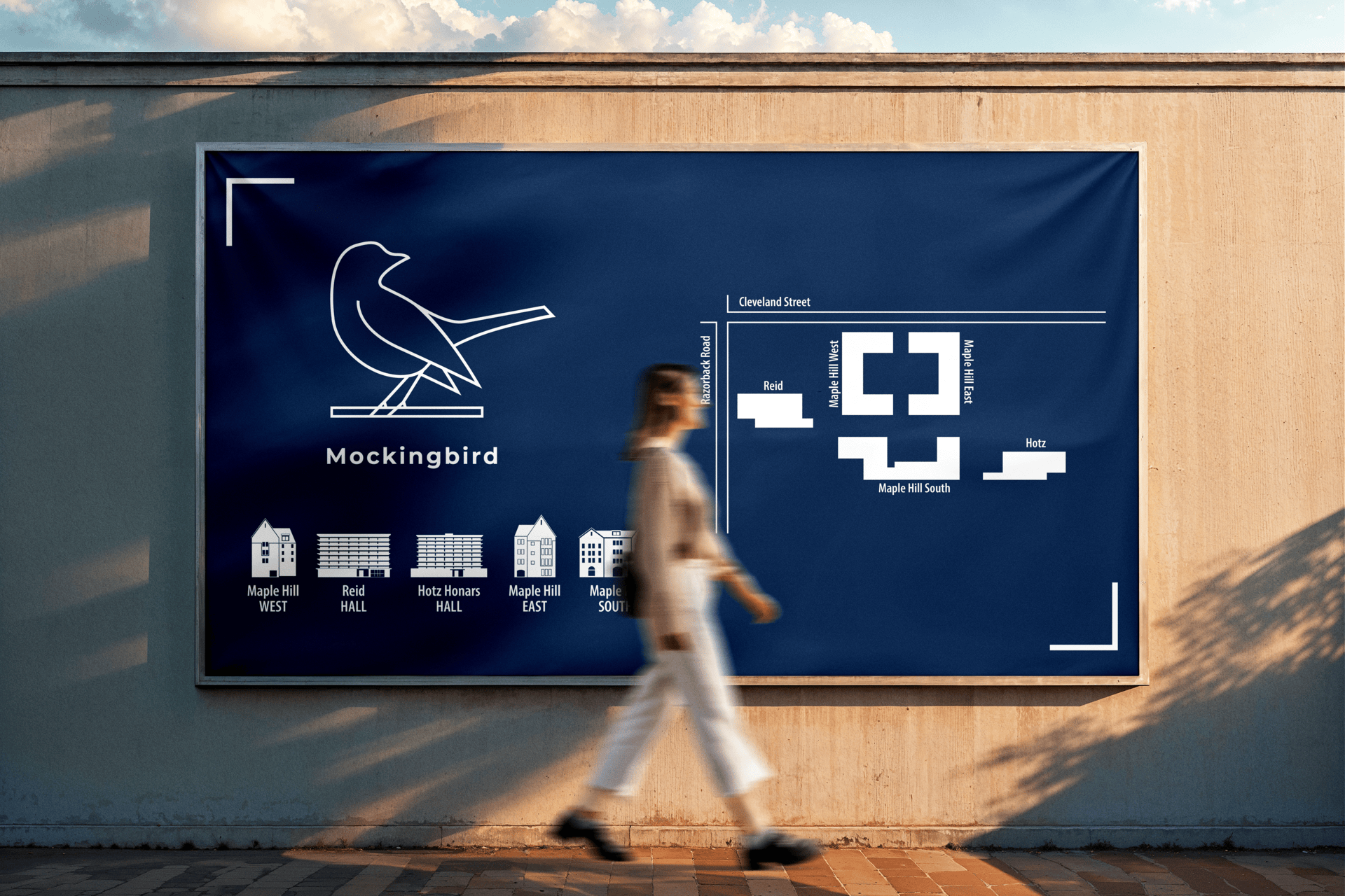
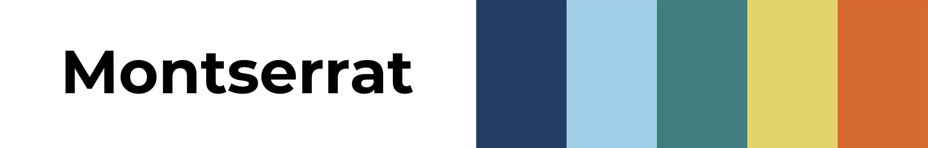
Montserrat was selected as the display typeface for the neighborhoods due to its simplicity and boldness. University Housing preferred to use their existing brand colors, with one modification: based on feedback, we chose a slightly darker navy blue for Mockingbird to improve contrast with the green and light blue.
One key aspect of helping returning students get used to this new neighborhood system was utilizing social media profile icons to show which halls are in which Neighborhood. It was cool to see a previous project I worked on be utilized in a new way, showing me that the Housing Department had faith in my design skills.
Process Screenshots: