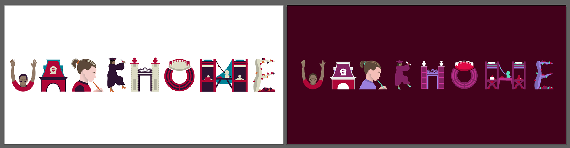
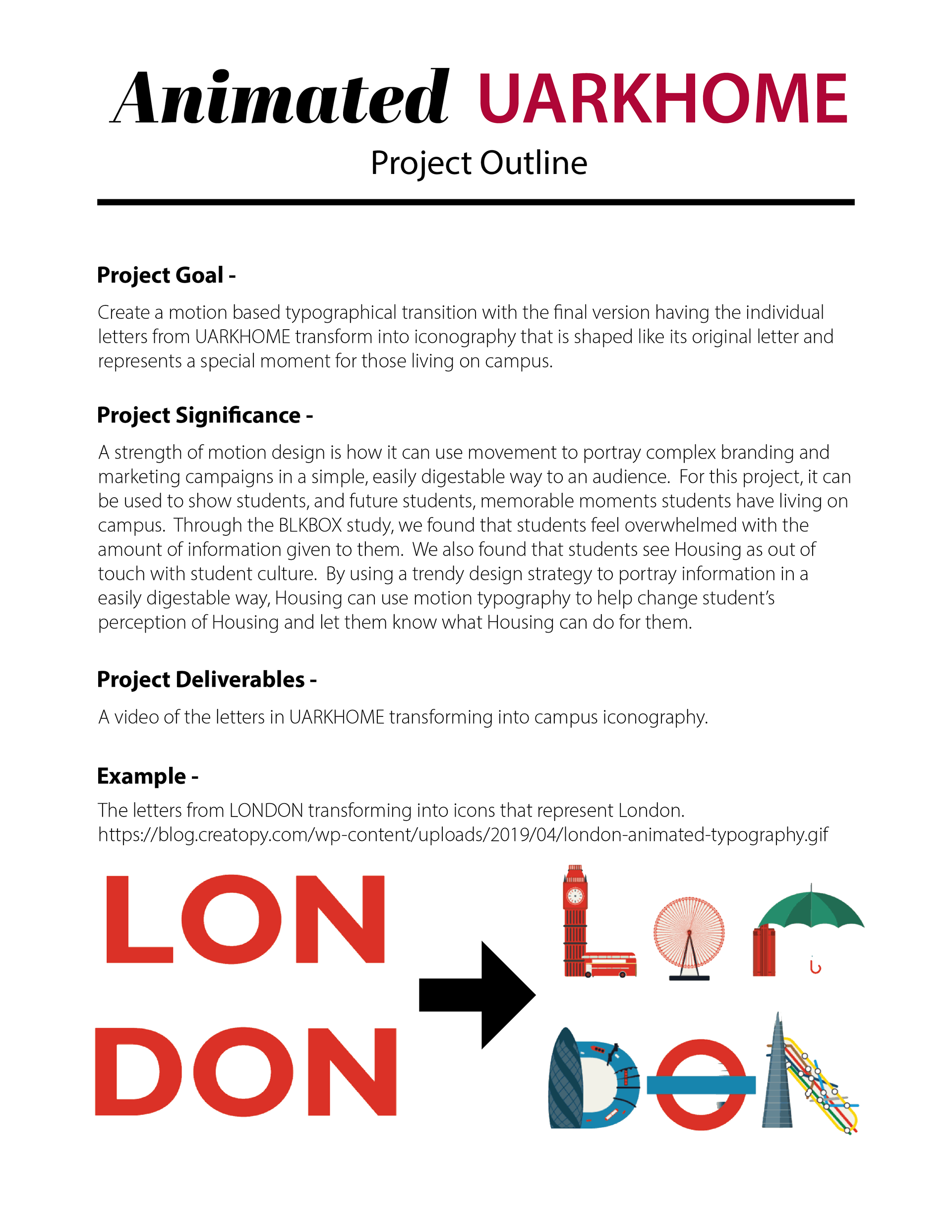
At the University, one of my responsibilities was to introduce new design trends to the marketing team. I successfully advocated for the use of motion typography in University Housing's marketing programs. My first project involved transforming the phrase "UARKHOME" into a dynamic representation elements of campus life.
Due to the scope of the project, I provided a project outline to leadership to get support for this change.
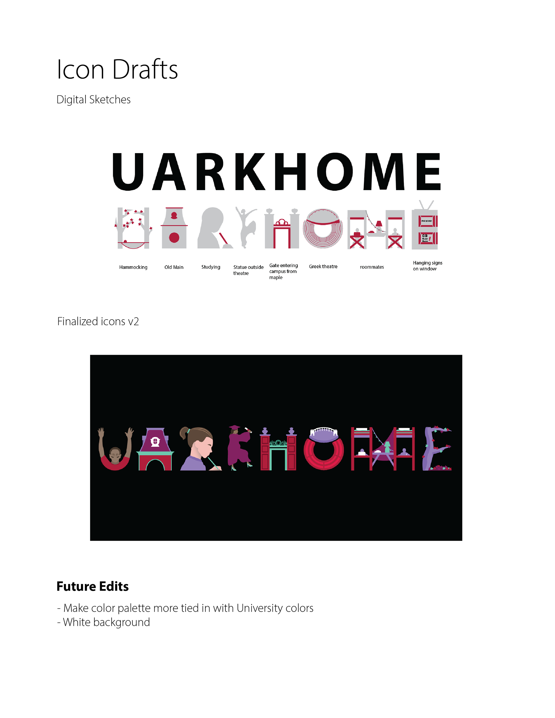
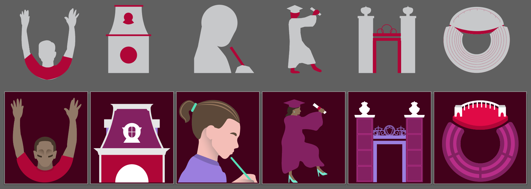
For each icon, I developed both a digital sketch and a final version. I initially created black-and-white versions to establish a color palette that would work consistently across all icons. Although marketing initially preferred experimental colors, they ultimately chose a more traditional university color scheme as the project progressed.